About the Project
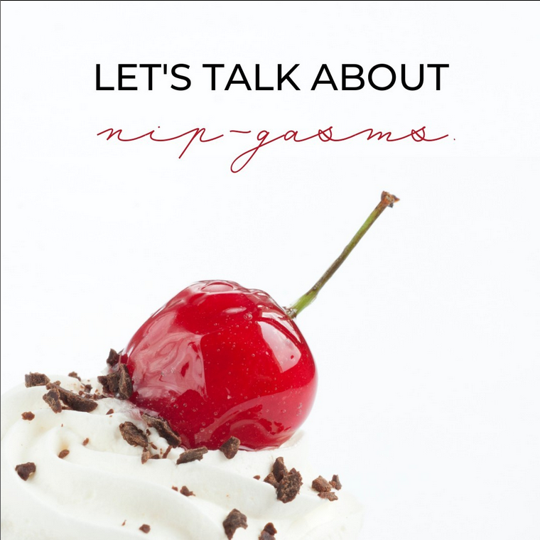
In early 2021, we were approached by a startup with a refreshingly ethical take on bespoke sex toys - sustainably produced, and crafted to suit the customer’s individual needs. Still in the development stages, this was a real opportunity to build an innovative brand from the ground up - and help them create a social media buzz in the lead-up to their product release.
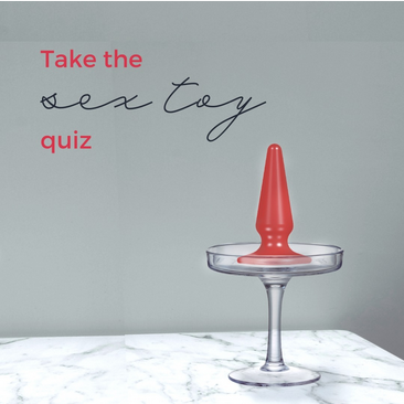
Our work for Melba included a named brand concept with logo design, accompanying graphics, image treatments, full website design and a complete brand book. We also set up the client with a full social media startup package - including a detailed guide for content and posting strategies - to help support the entrepreneurs in the crucial first stages.
Services: Brand Design & Strategy, Graphic Design, Website Design
Art Direction: Darya Meszkes ; Website Design: Alexandra Anghel ; Graphic Design: Sophie Toland
Brand Concept
peach melba– / [pɛʃ mɛl.ba] /
a dessert of peaches and raspberry sauce with vanilla ice cream. It was invented in 1892 or 1893 by the French chef Auguste Escoffier at the Savoy Hotel, London.
a dessert of peaches and raspberry sauce with vanilla ice cream. It was invented in 1892 or 1893 by the French chef Auguste Escoffier at the Savoy Hotel, London.
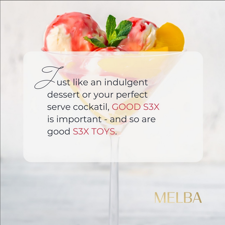
An indulgent and colourful experience, like biting into an exquisite dessert or drinking an expensive cocktail. Inspired by high-end desserts and mixology, Melba is all about playfulness, experimentation, and savouring pleasure.
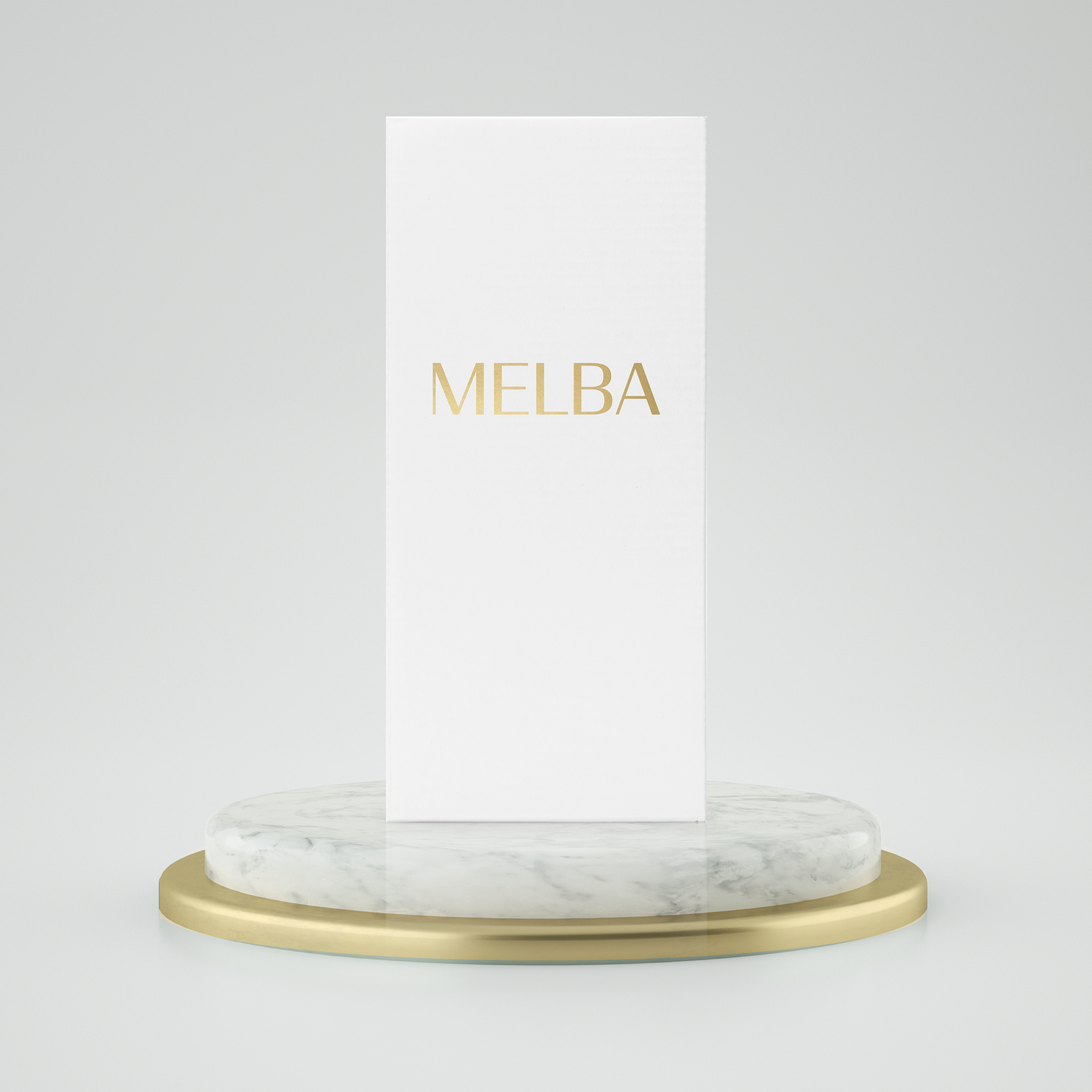
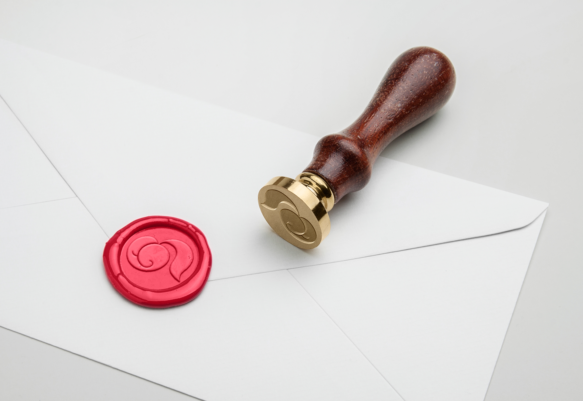
The Logo & Icon
Peaches, and the concept of ‘peachy’ was the perfect encapsulation of wit and sexiness to us - and so it became a central element of the brand identity, while the logo type was kept simple and classy.
Colour & Typography
Peaches, and the concept of ‘peachy’ was the perfect encapsulation of wit and sexiness to us - and so it became a central element of the brand identity, while the logo type was kept simple and classy.
Brand in use
Peaches, and the concept of ‘peachy’ was the perfect encapsulation of wit and sexiness to us - and so it became a central element of the brand identity, while the logo type was kept simple and classy.
